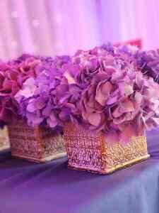
Fifty Shades of Purple
Written by: Doreen Amico-Sorell
Purple has been getting a lot of attention lately from the Interior Design world. (And no… I’m not talking about Purple, the company, that’s offering bedding, pillows and linens.) I’m talking about PURPLE, the color. No longer just a minor accent color, but rather a color with such diverse personality and depth of nuance, it’s poised to take the industry by storm as the next “neutral.” But… how? The secret lies in it’s ability to seamlessly adapt and “play-well” with most other colors.
But First, some disclosure…
OK, I must admit that purple is my favorite color and has been ever since I was able to say the word “purple”; just take a look at my company’s logo! And forget that it was the driving force behind my travel to France to see the rolling hills of lavender. Though important to me, it’s not the reason for this blog. I’m writing because I’m seeing an interesting trend in the Interior Design Industry today and want to inspire you to think beyond the ordinary; just like the Impressionist painters who were inspired by their times and surroundings.
Please… No More Blue!
In the land of decorating, for the last several years, we have been caught in a holding pattern where most everyone wants a neutral palette in their home. Every shade of white, gray and taupe has been used alongside their trusty sidekick—blue. This has been a great direction in which to go because, before that, we were inundated with every shade of beige known. So yes… neutrals are highly desired as they afford so many possibilities when it comes to decorating your home. They work well with most any design style and provide a great canvas for other pops of color, should you wish to implement such. But, I’m here to say, ditch the ordinary in favor of the new purple.
The Trend
Currently, ever so subtly, there has been a nod to purple when looking for something different to enhance the neutrals of white, gray and beige. Hence, we’ve seen it incorporated in throw pillows, art work and flowers, and for the brave, even into sofas and accent chairs. And, prior to that, blue was the predominant color of choice in fabrics, rugs, and even cabinets, paired with these same neutrals. But tastes are changing and trends are evolving. Move over blue, because there’s a new sheriff in town! Purple, whether bold, soft or vibrant, will always get attention.
While some may say that purple is nothing really new as it is akin to blue in that, as per the color wheel, it is merely a secondary color born out of mixing blue with red, I’m here to say NOT SO! Purple is VERY different. The psychology of purple evokes feelings of spirituality, mystery and calm; a color traditionally the symbol of royalty and wealth. But let’s be real, it can also be reminiscent of a childhood favorite dinosaur; but let’s not go there. This is why purple is so misunderstood. In my experience, most people either love it or hate it.
While it still may not be for the faint of heart, in its new incarnations, it does go well with so many colors and offers such a variety of shades and undertones, from violet, grape and eggplant to amethyst, lilac and lavender! Just take a look at the picture below.
And, for those less daring, the new purples can still pleasingly complement the staid, tried-and-true neutrals of white, gray and beige.
The Best Part
Just remember… It’s fun to experiment with color and play with design. So go ahead and take the plunge… just do it! Pick a purple you like and see how, acting as a neutral, it pairs with the furnishings, accessories and accent pieces of your choice. Get away from the boring, venture into the exciting and run ahead of the pack. And… before you know it, PURPLE may too become YOUR favorite color as well.


